Supported Input Devices
The user interface of TouchCORE was optimized for input from multitouch-capable devices, but all functionality can also be triggered using a standard keyboard and mouse. Hence, in the entire user guide, the following terms are used to describe interactions with the TouchCORE user interface:
- Tap refers to both, a tap using a touchscreen and a click using the primary mouse button.
- Tap-and-hold refers to touching a graphical element, or alternatively holding the primary mouse button pressed, for a prolonged period of time, i.e., until the circle on the screen fills up completely.
- Double-tap refers to two consecutive touches, or two primary mouse clicks, within a short period of time.
- Drag refers to touching a graphical element and then moving your figure to a new location while still touching the surface. Similarly, with the mouse, graphical elements are dragged by clicking on the element and then moving the mouse while still holding the mouse button down.
- Panning the current view can be done by using a two-finger drag gesture (or alternatively, dragging with the secondary mouse button pressed down on the background).
- Zooming can be achieved using a two finger pinch gesture (or alternatively using the scroll wheel of the mouse) on the background.
General Interaction with GUI Elements
Generally, graphical elements (menus, model elements, text) can be interacted with in the following ways:
- Double-tap allows editing of that property by either entering/changing text or using a selector to choose between a predetermined set of options.
- Tap-and-hold on an element provides a menu with additional options for that element.
- Dragging a graphical element changes its position on the screen, if allowed.
- Some UI elements allow a unistroke gesture, which is indicated by a yellow line. Tap and then move while still holding down. For example, drawing a rectangle on the background of the class diagram allows to create a class.
Menus
TouchCORE does not have a classic menu bar usually found in most applications. The menu bar has been replaced by a circular menu (see Figure 1), which is more suited for touch-enabled applications. The menu can conveniently be moved anywhere on the display surface by dragging the center. Tap-and-holding on the center toggles the textual help on and off.
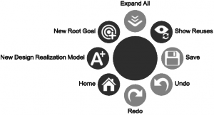
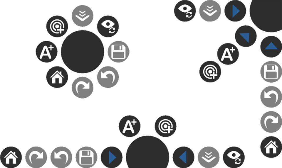
Depending on it’s position (center, side or corner) and number of actions accessible from the menu, the circular menu adapts its shape and positions of the actions around the center circle to optimize direct access to the actions (see Figures 2). If there is not enough space to display all action buttons, the actions are grouped into sub-menu’s that can be expanded/collapsed by clicking on the expand/collapse triangle.